포엔지 리브랜딩 제안 (FOR.N.G Rebranding Proposal)
포엔지는 설립한 지 5년 된 회사입니다. 초기에는 주로 시공 중심의 업무를 담당해 왔습니다. 프로젝션 설치나 유지보수 등 기술적 시공에 강점을 가지고 있었지만, 기획이나 설계, 콘텐츠 디자인은 외부에 의존하는 경우가 많았습니다.
그러나 회사의 목표는 단순한 시공을 넘어, 기획·설계·콘텐츠 디자인까지 아우르는 종합 디스플레이 솔루션 기업으로 도약하는 것이었습니다. 이러한 비전을 반영해, 포엔지가 앞으로 기술과 디자인을 융합한 새로운 정체성을 확립할 수 있도록 리브랜딩 방향을 제안했습니다.
FOR.N.G is a company established five years ago. In its early years, the business mainly focused on construction-oriented work, excelling in technical areas such as projection installation and maintenance. However, planning, design, and content creation were often outsourced to external partners.
The company’s goal, however, has been to go beyond construction and grow into a comprehensive display solution provider that encompasses planning, design, and content creation. Reflecting this vision, a rebranding direction was proposed to establish a new identity that integrates both technology and design.
The company’s goal, however, has been to go beyond construction and grow into a comprehensive display solution provider that encompasses planning, design, and content creation. Reflecting this vision, a rebranding direction was proposed to establish a new identity that integrates both technology and design.
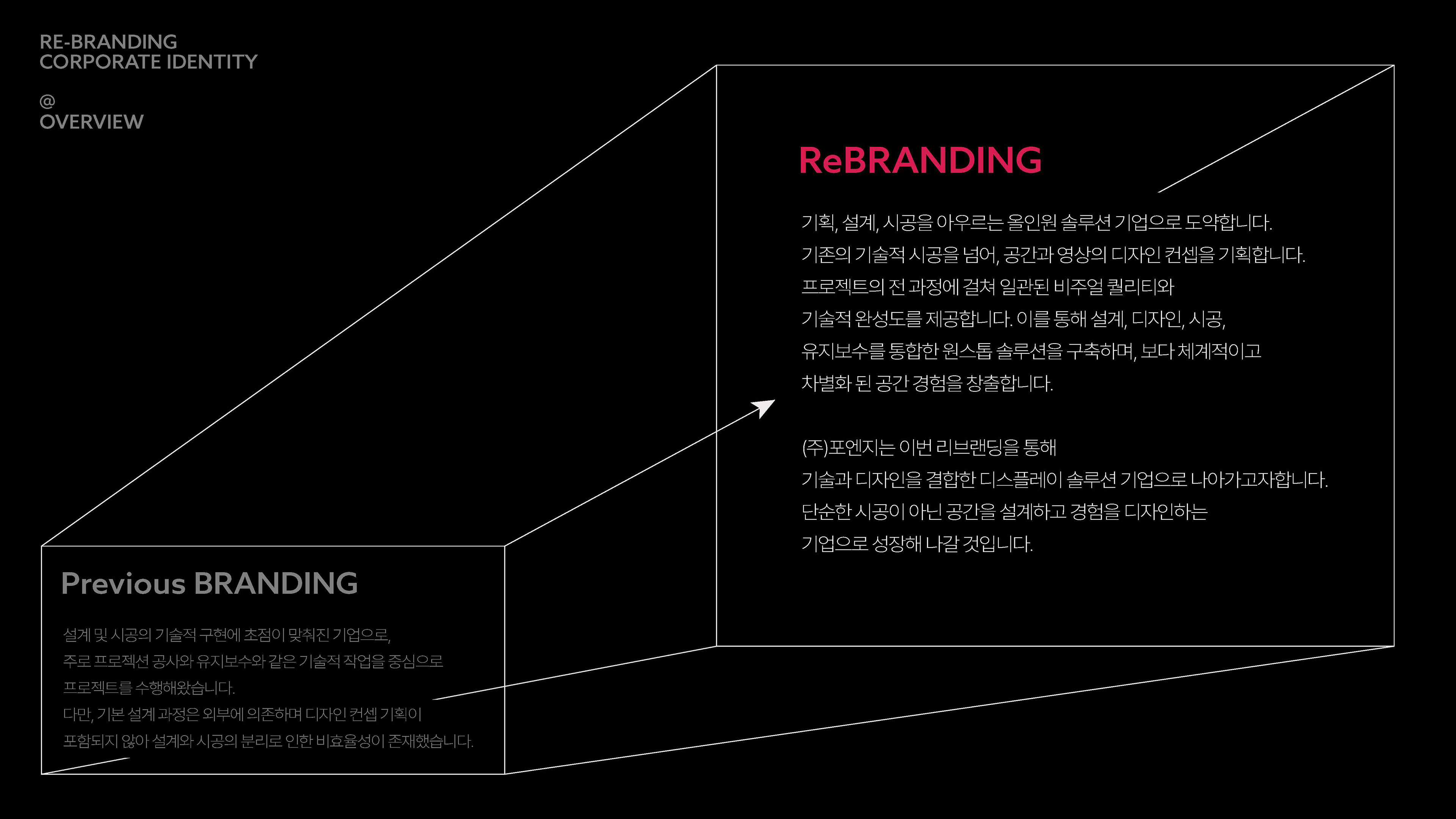
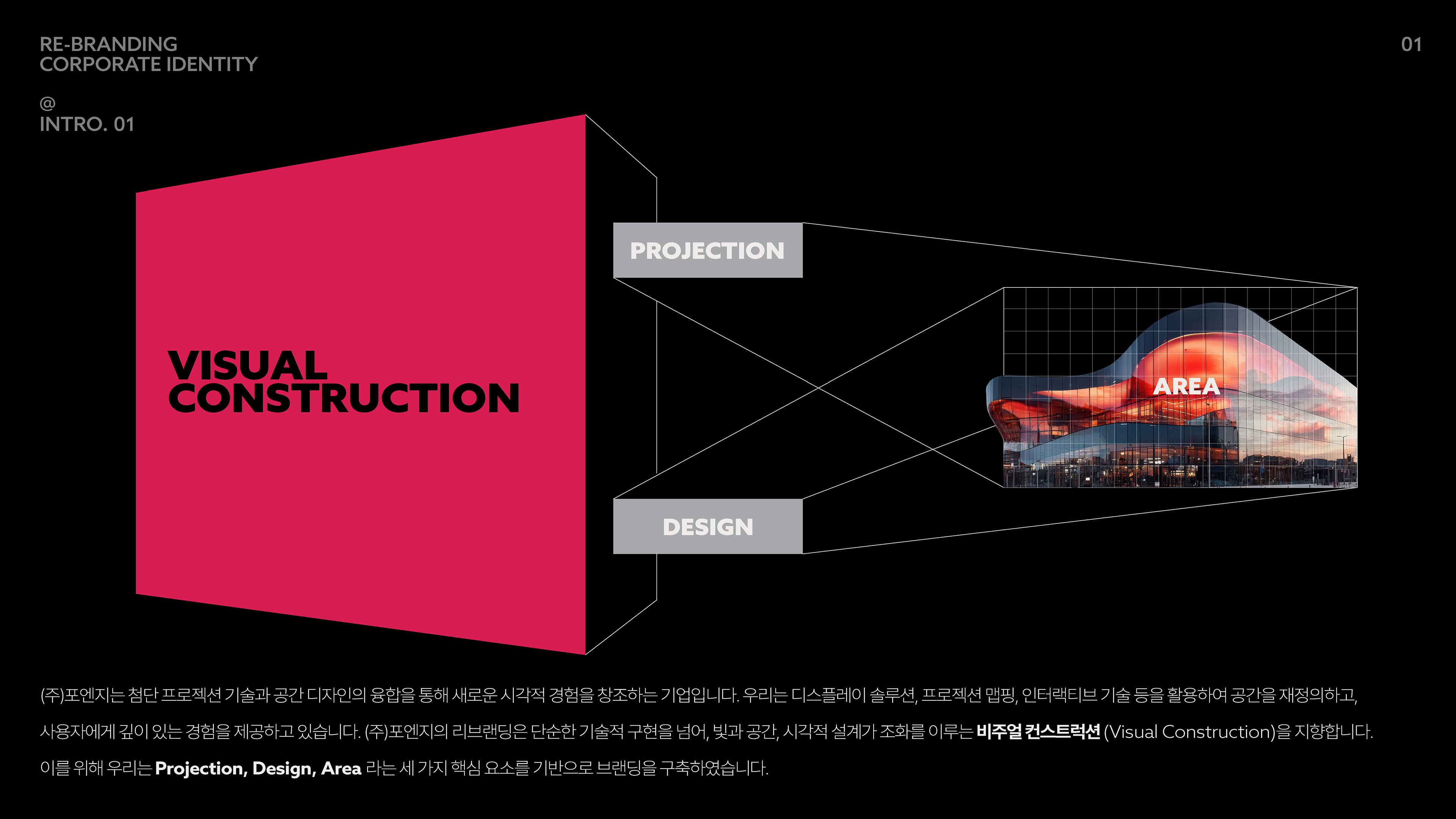
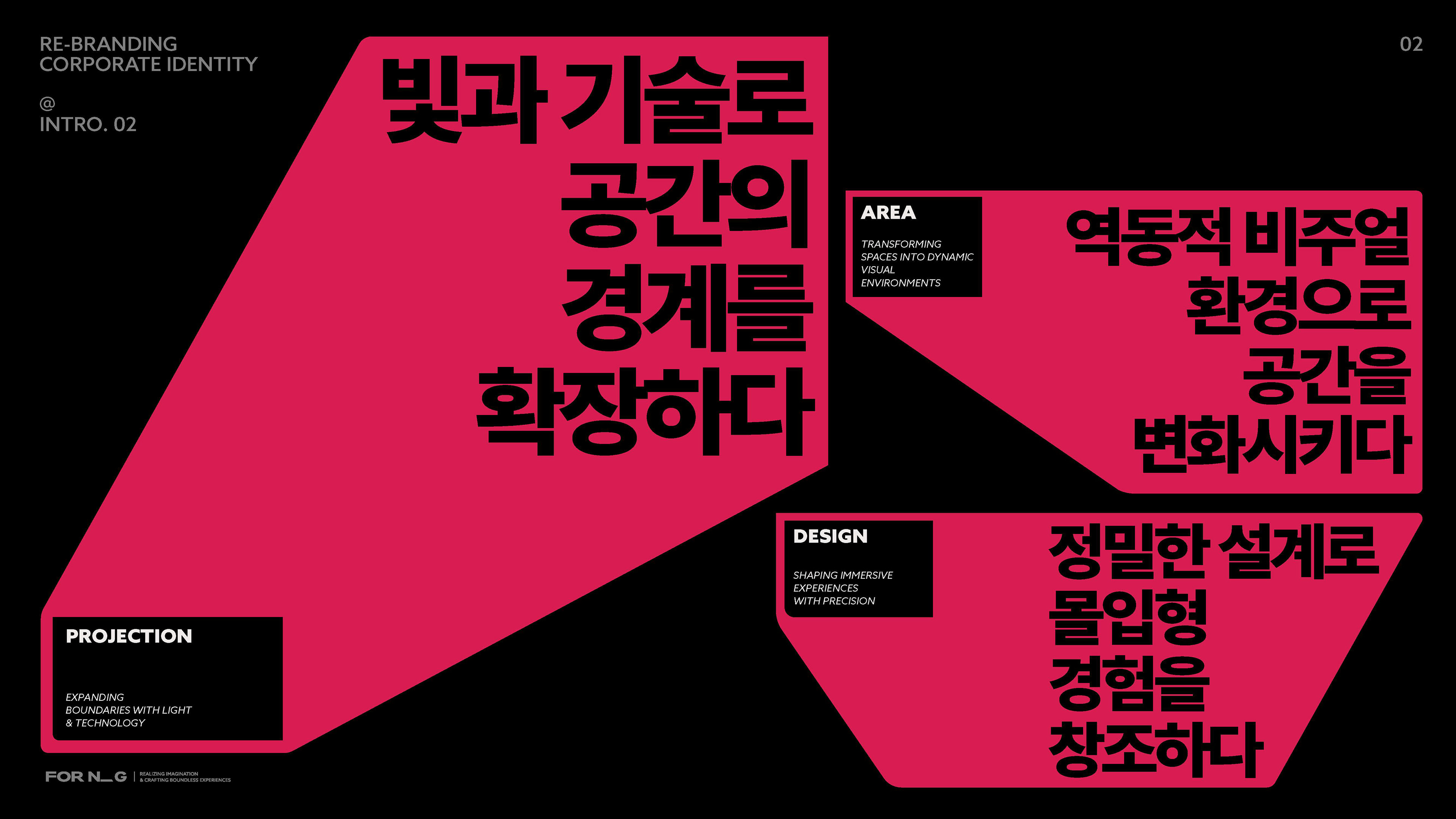
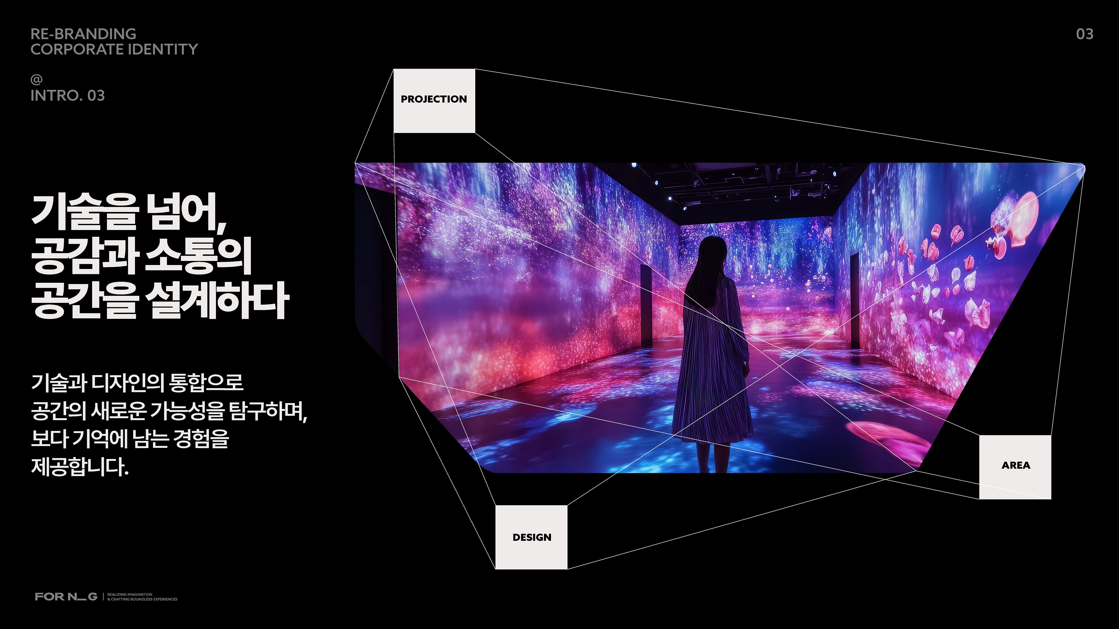
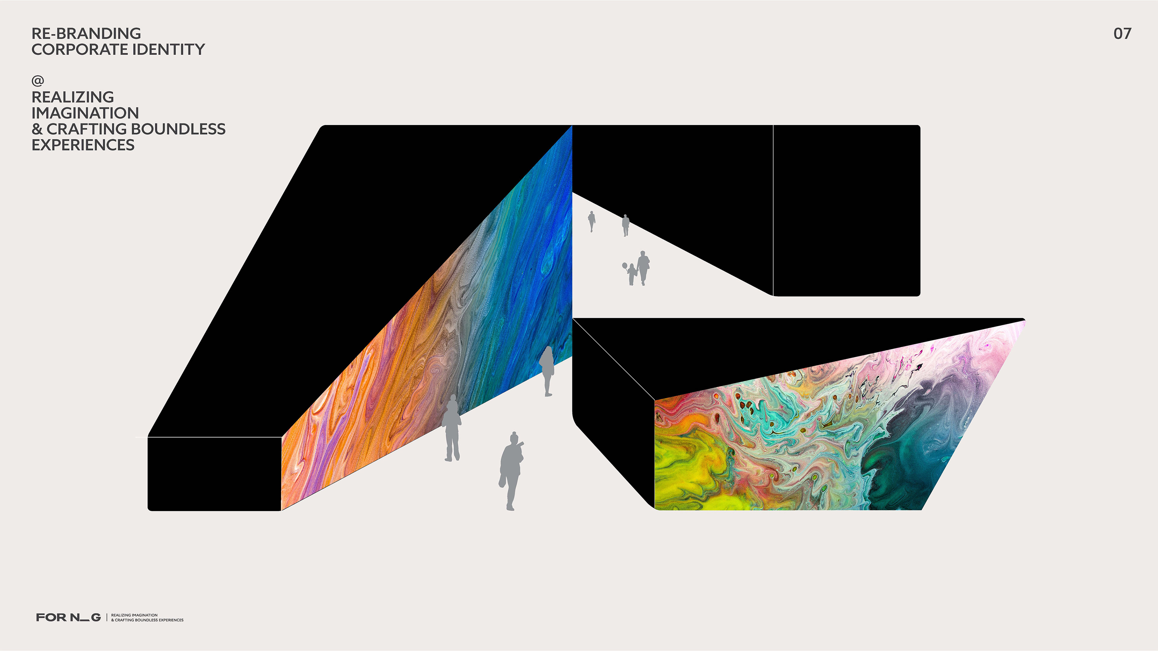
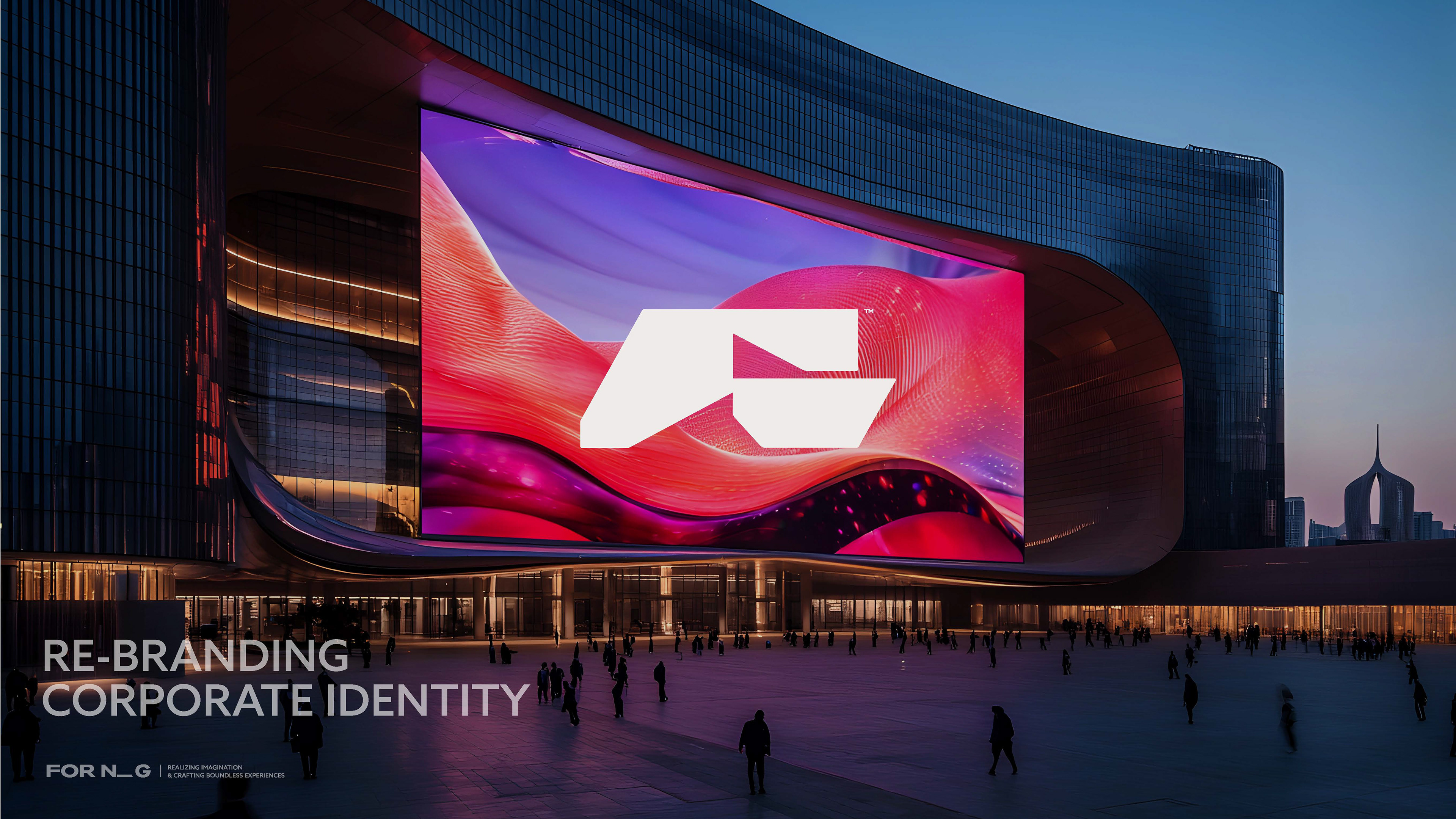
포엔지 리브랜딩 제안은 시공 중심에서 벗어나, 기획부터 콘텐츠 제작까지 아우르는 올인원 디스플레이 솔루션 기업으로 확장하기 위한 비전을 담고 있습니다. 기술적 완성도와 더불어, 빛과 공간, 시각적 경험을 통합적으로 설계하는 기업이라는 새로운 브랜드 이미지를 구축하는 것이 이번 제안의 핵심입니다.
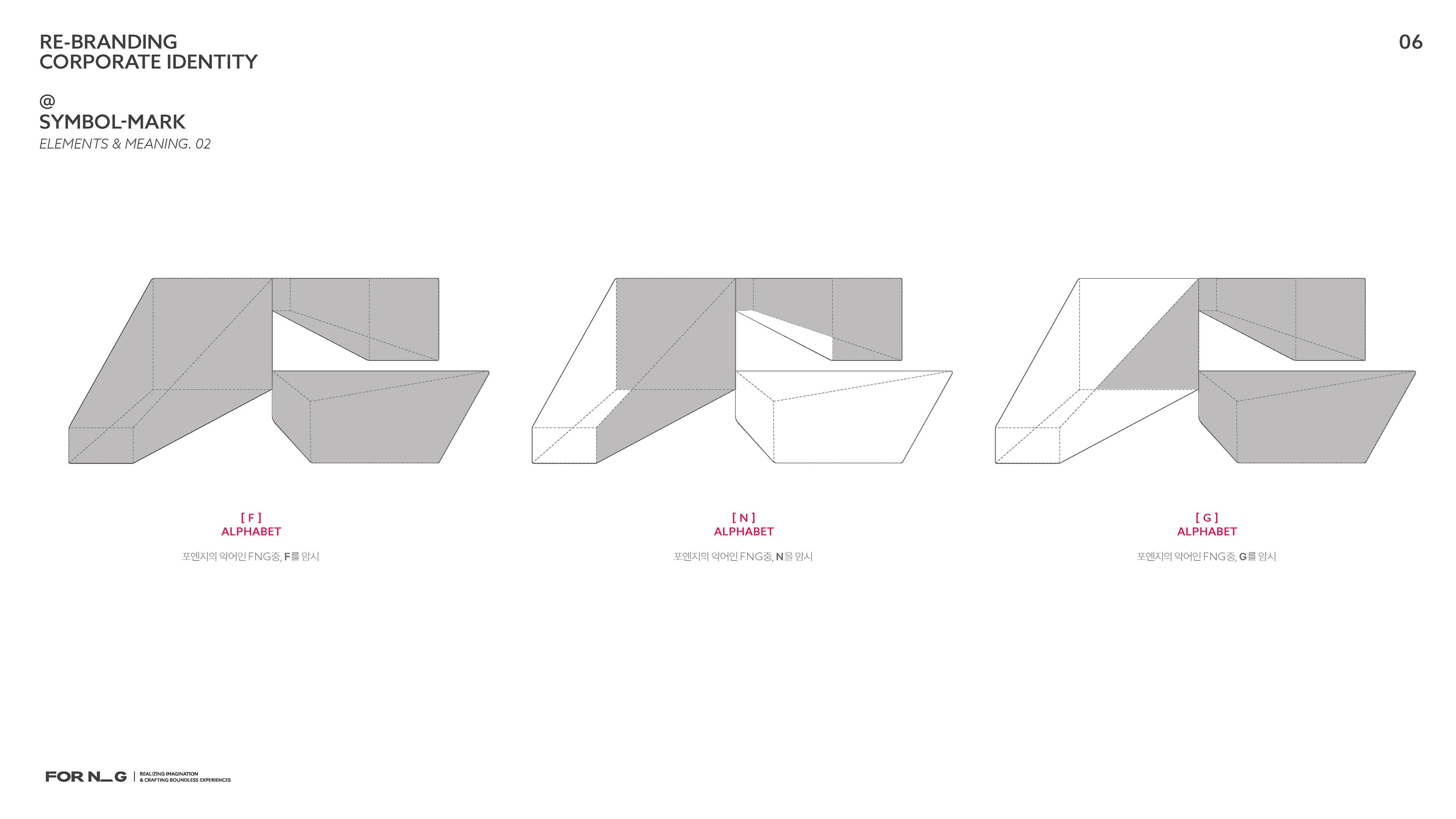
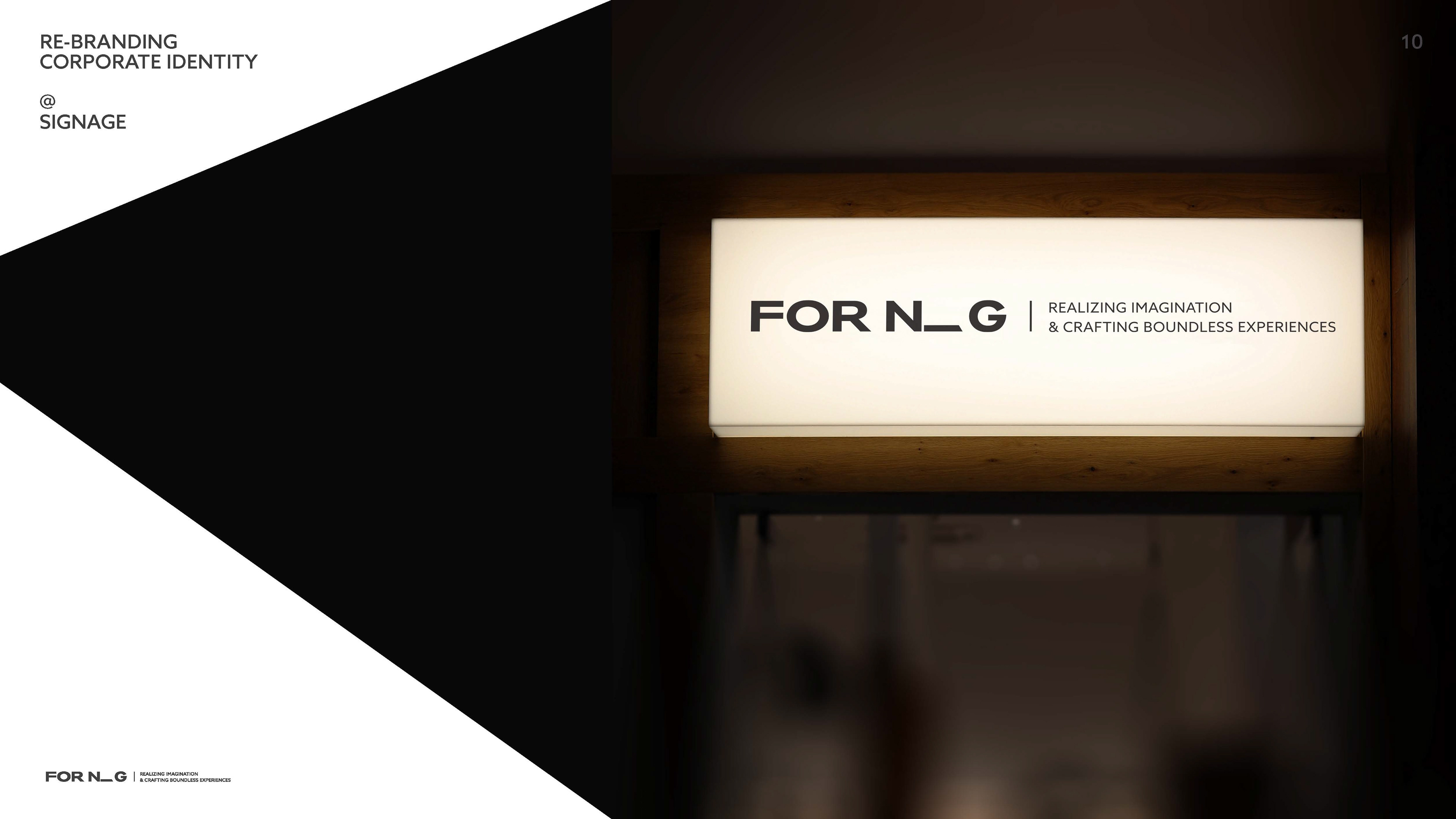
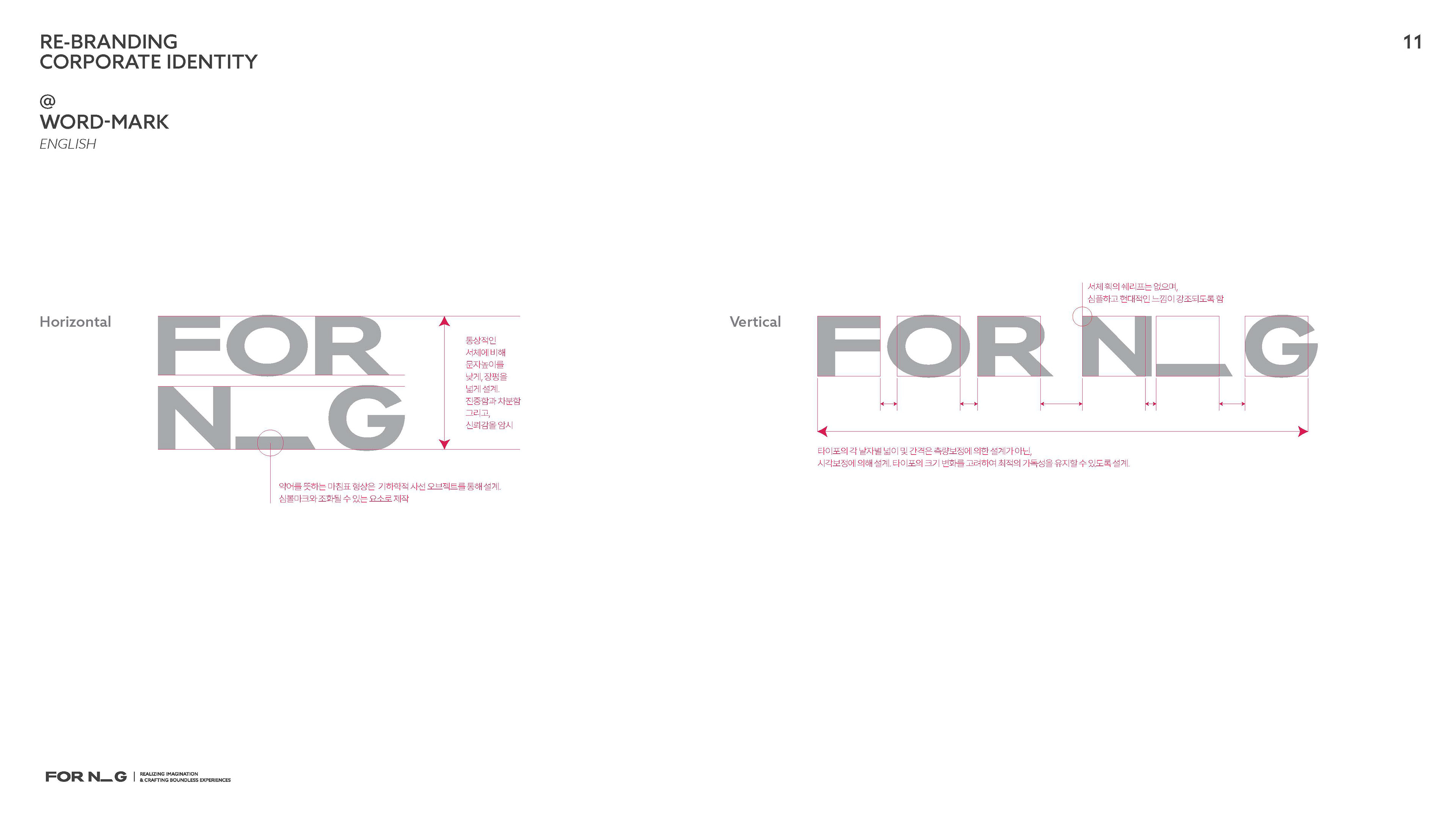
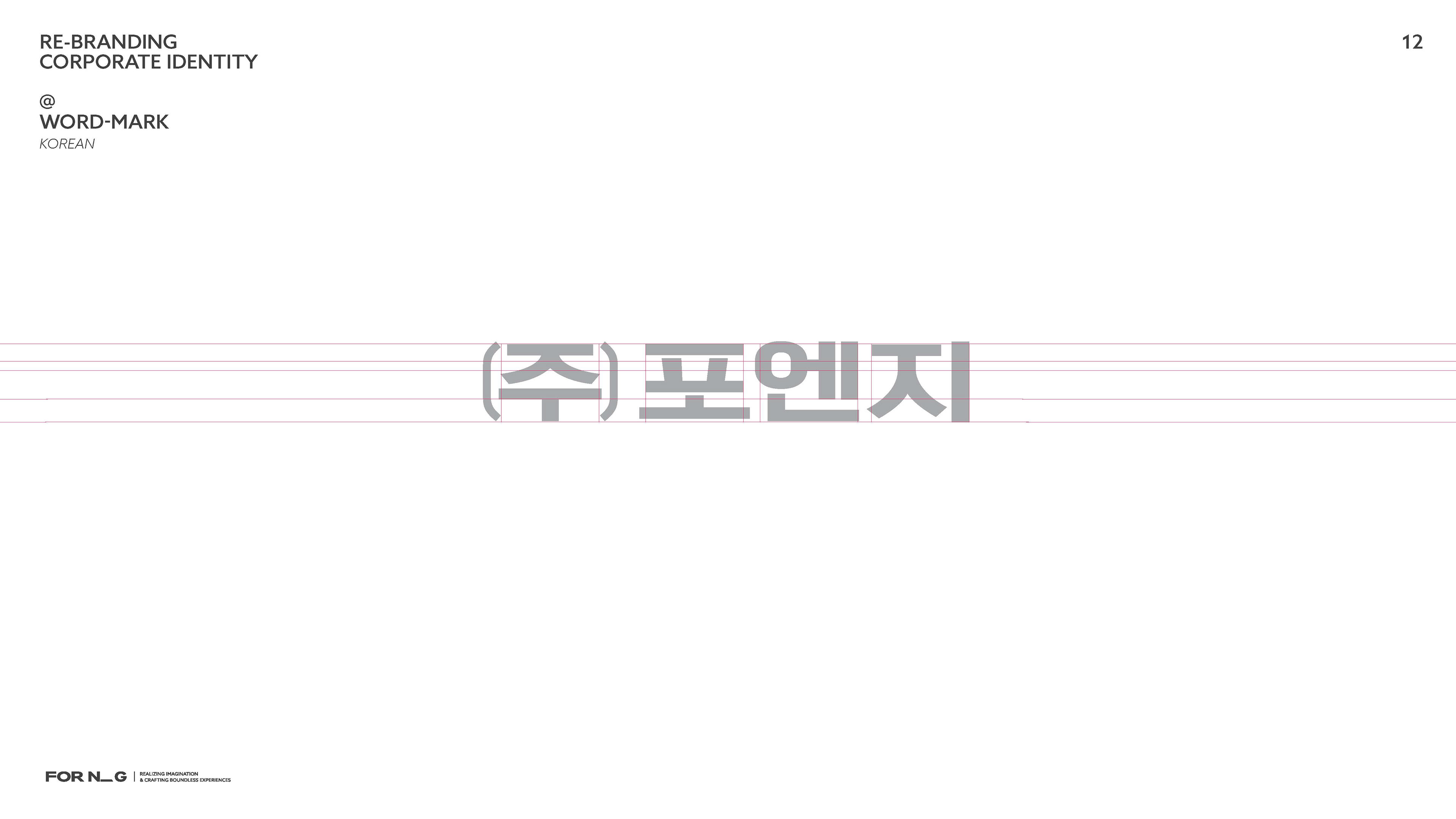
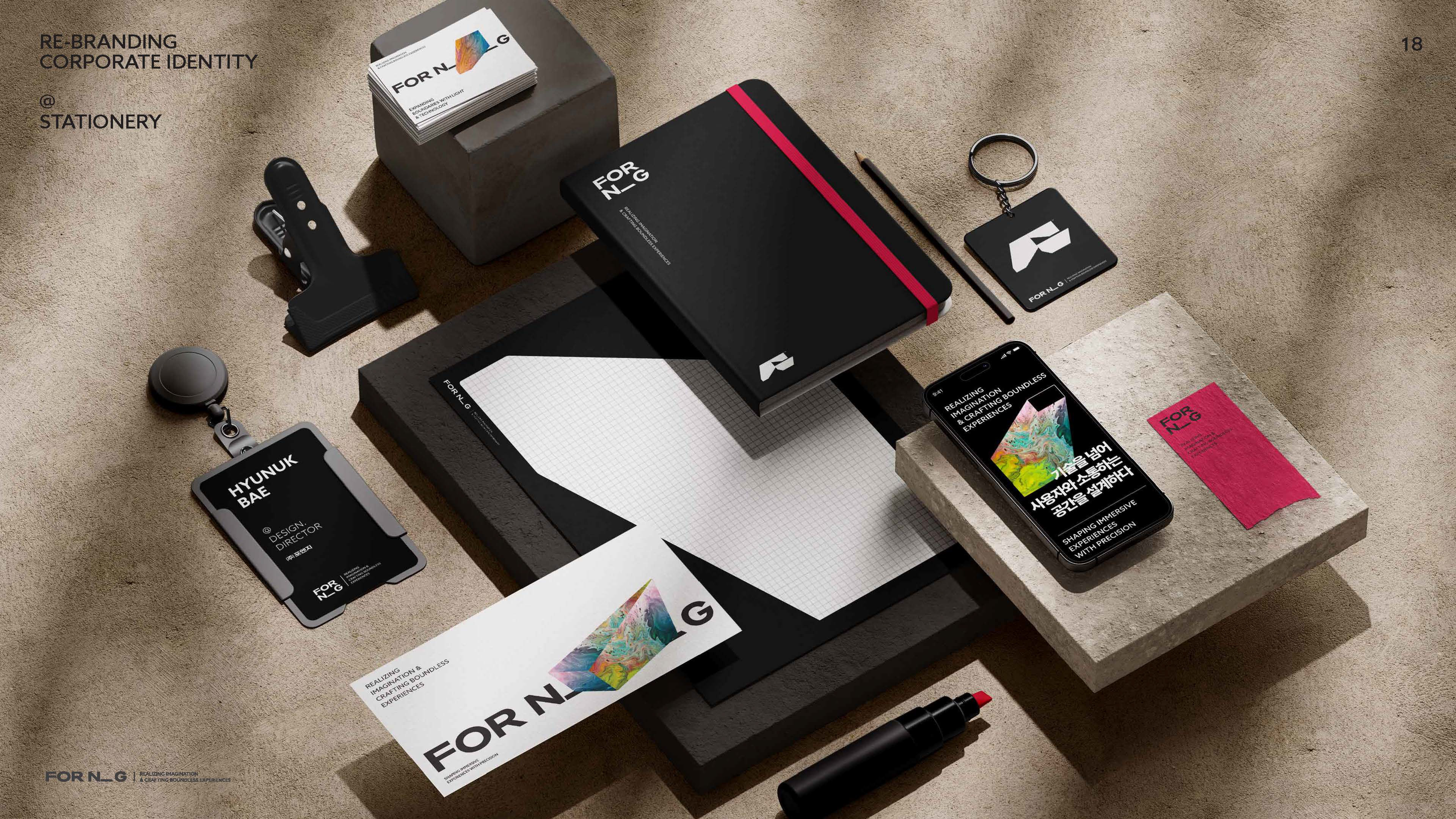
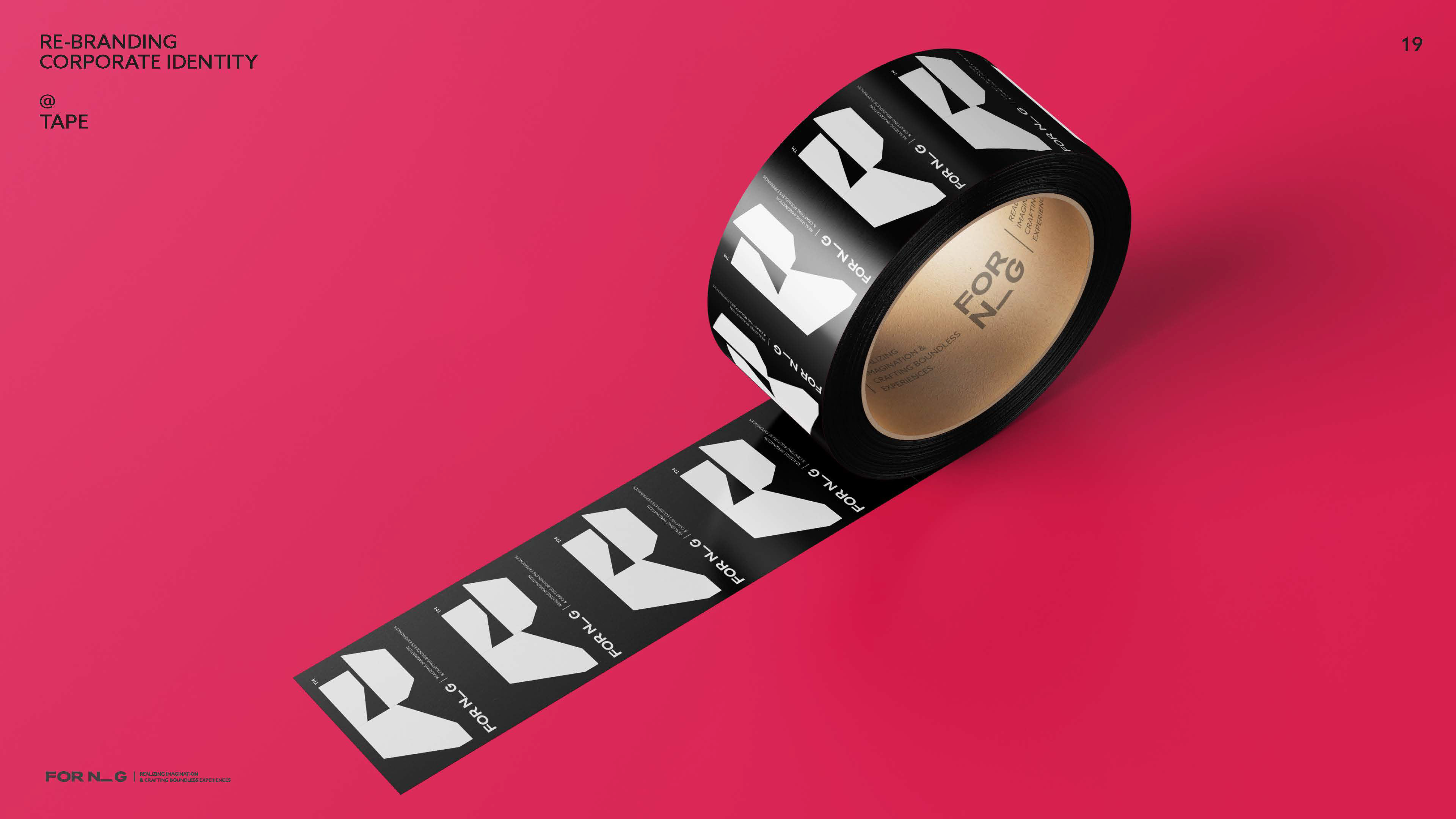
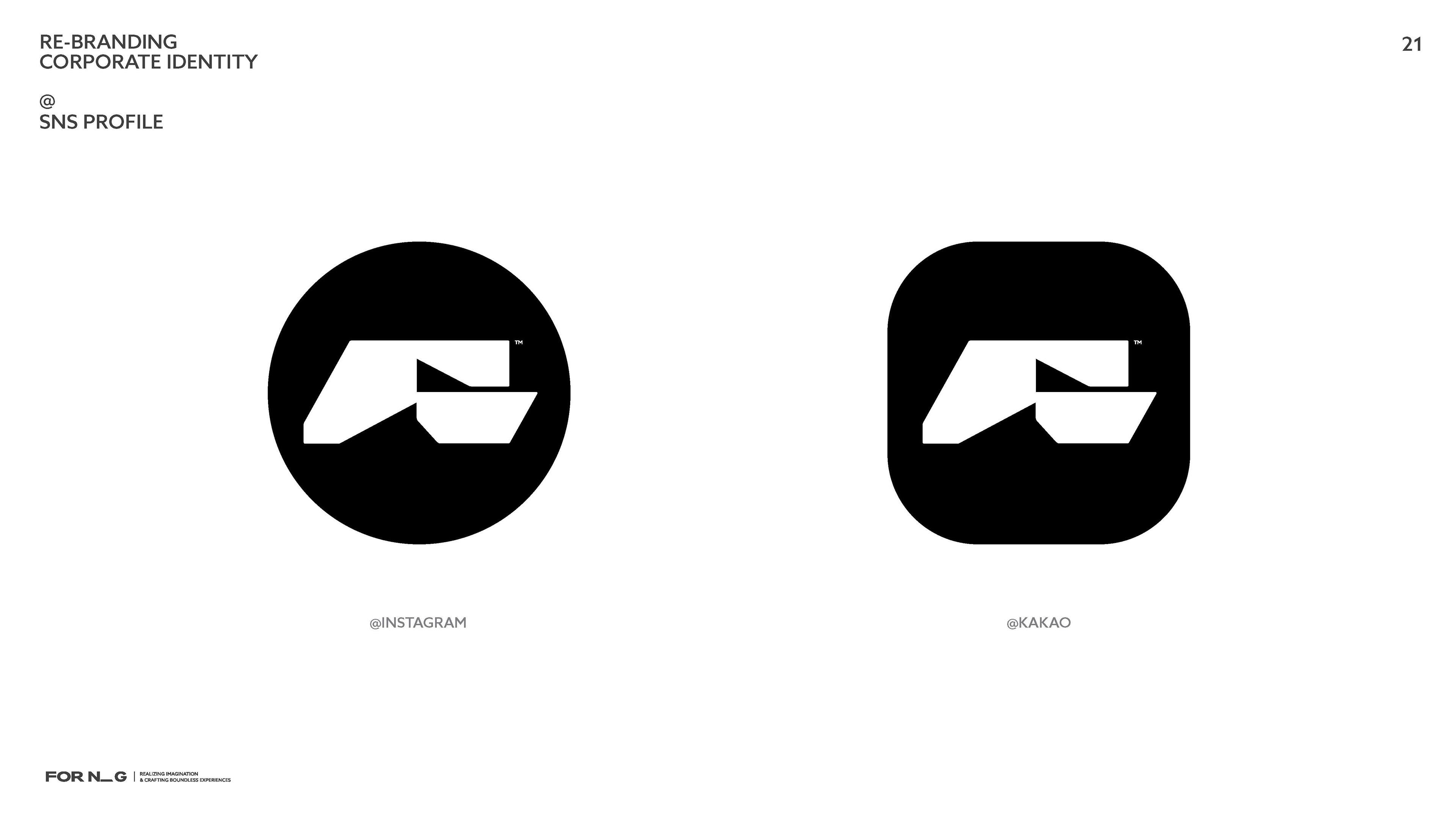
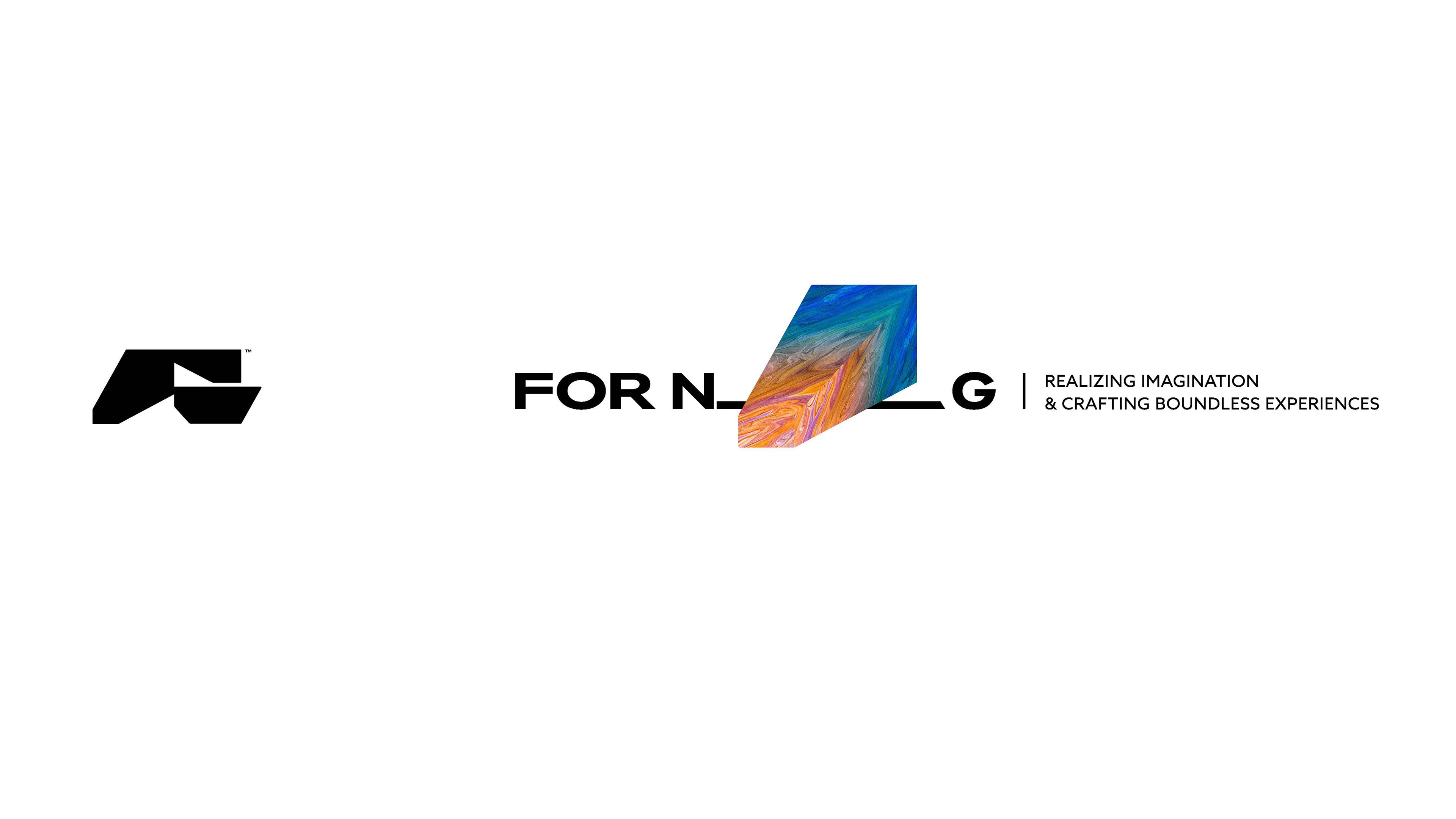
@ 심볼과 워드마크
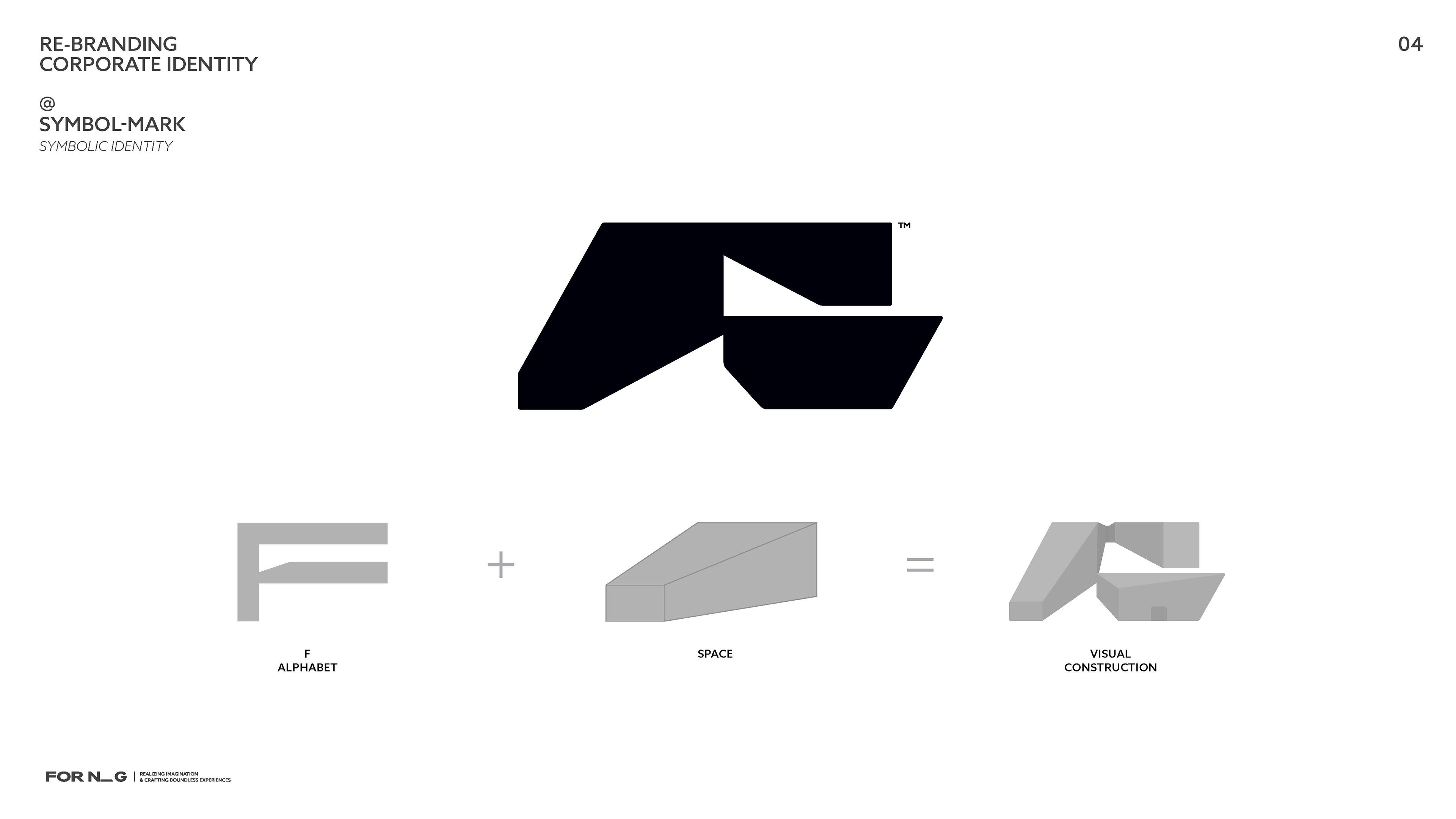
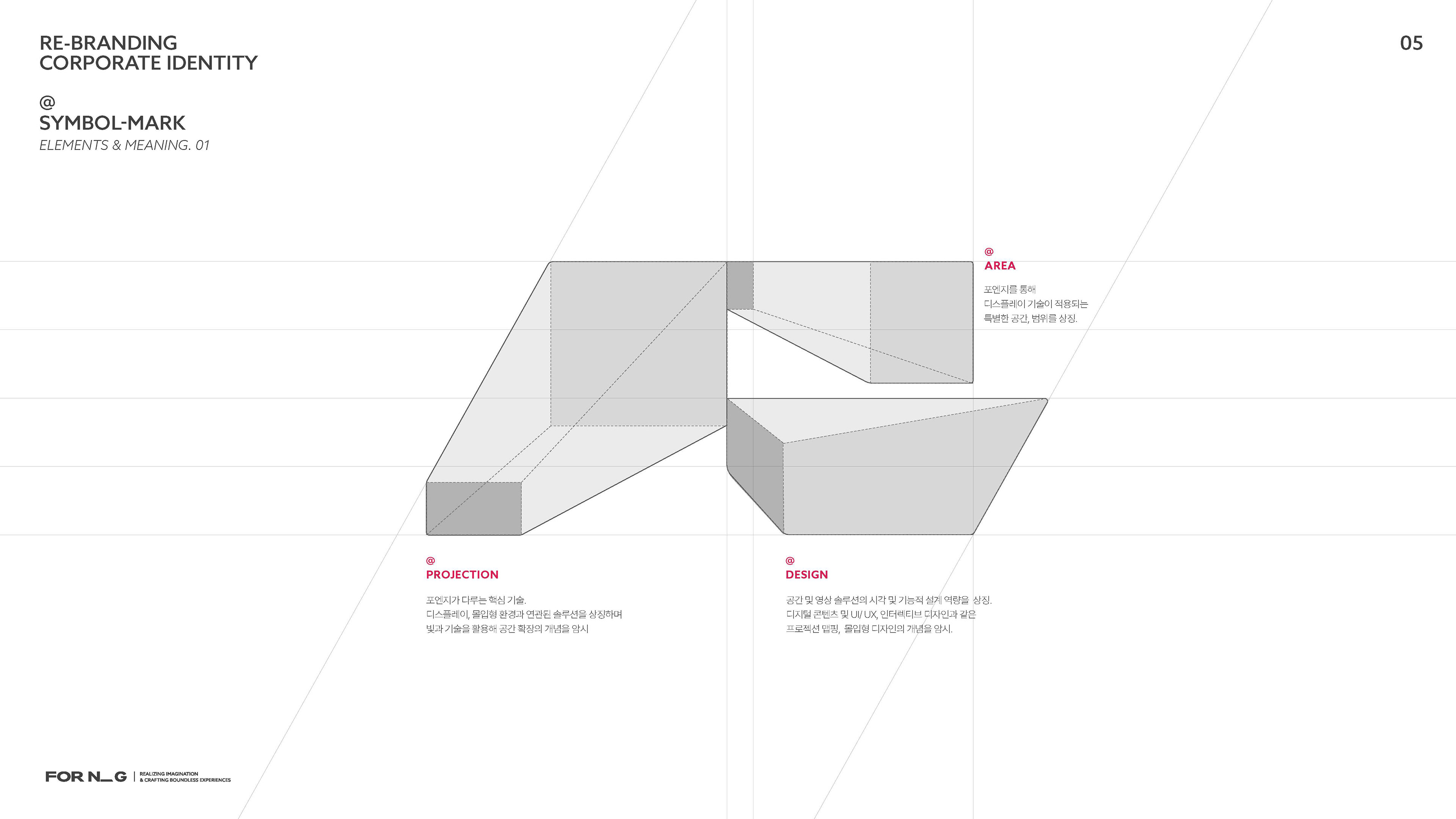
심볼은 FNG 알파벳을 기반으로, 디스플레이와 공간 디자인, 몰입형 환경을 상징하도록 구성했습니다. 워드마크는 차분하고 신뢰감을 주는 현대적 서체를 적용하여 기업의 전문성과 안정감을 표현했습니다
The FOR.N.G Rebranding Proposal envisions the company’s evolution from a construction-focused business into an all-in-one display solution provider, covering everything from planning to content production. The essence of this proposal is to establish a new brand identity that goes beyond technical excellence, embracing the integration of light, space, and visual experiences into a cohesive design.
Symbol & Wordmark
The symbol, inspired by the FNG alphabets, represents display, spatial design, and immersive environments. The wordmark adopts a clean and modern typeface, reflecting professionalism and reliability while reinforcing the company’s refined identity.
The symbol, inspired by the FNG alphabets, represents display, spatial design, and immersive environments. The wordmark adopts a clean and modern typeface, reflecting professionalism and reliability while reinforcing the company’s refined identity.