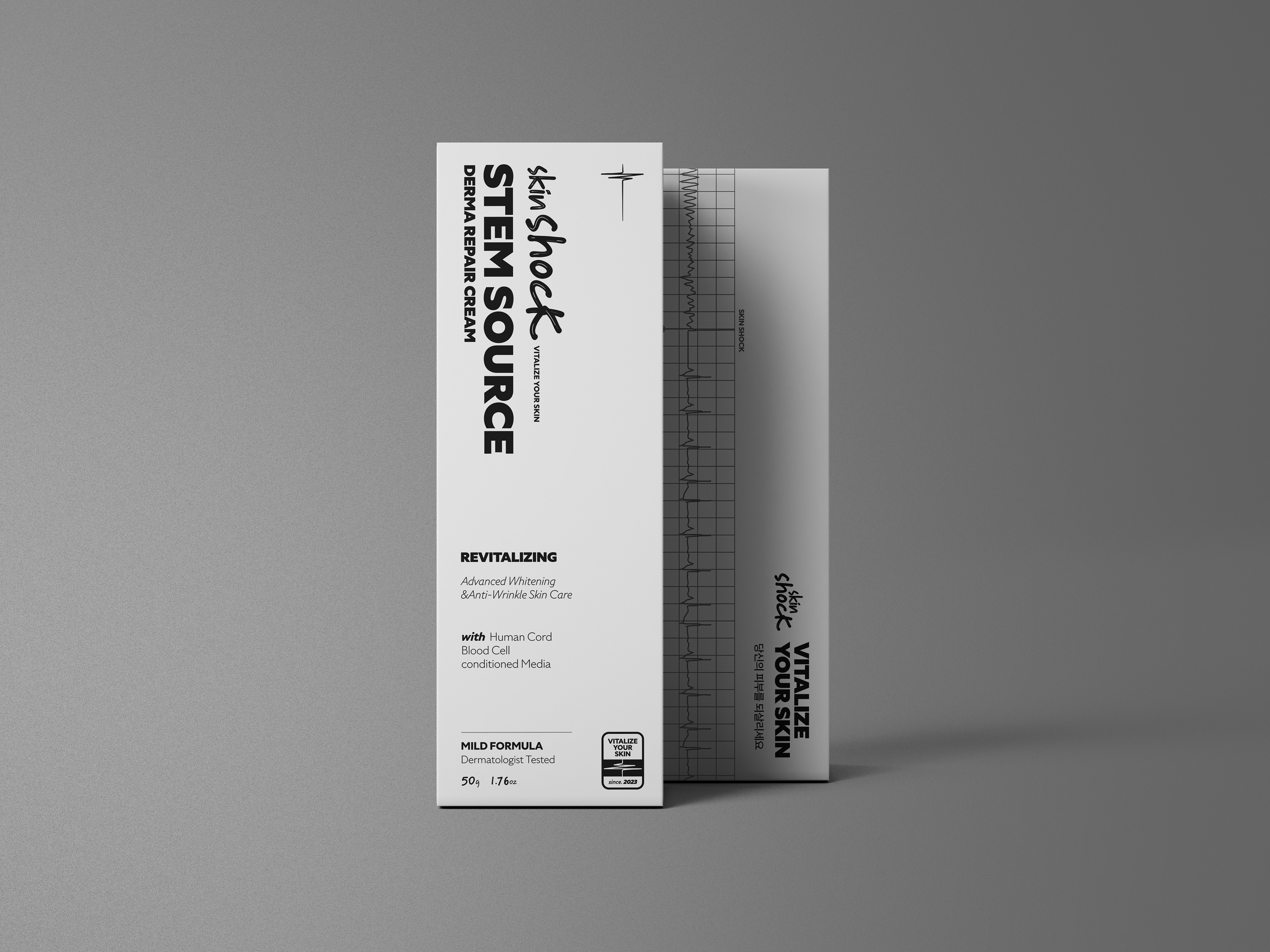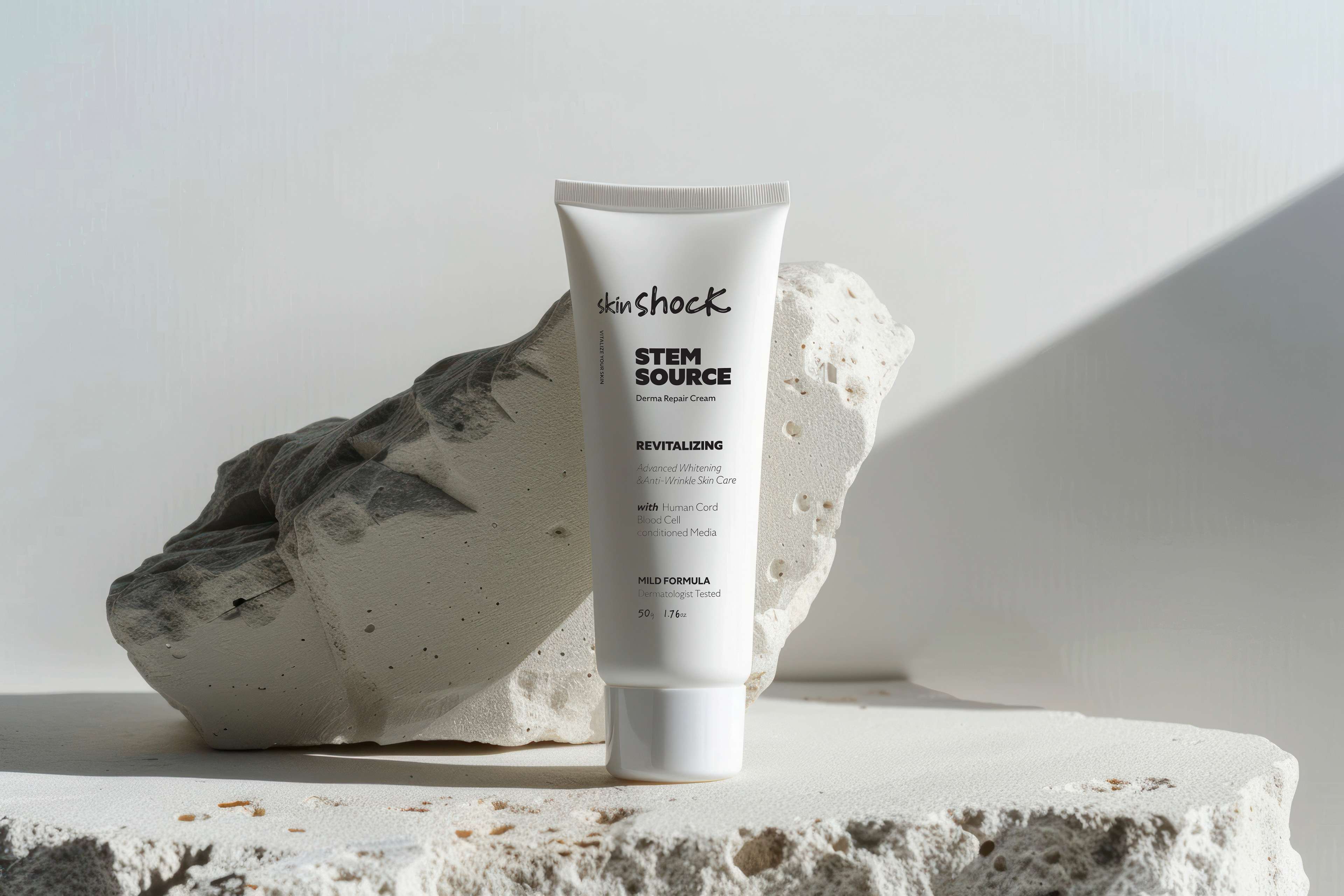
스킨쇼크 패키지 디자인(튜브형, 박스)
Skinshock Package Design
스킨쇼크는 미백과 주름 개선에 효과적인 기능성 화장품 브랜드로, 제세동기(Defibrillator)의 생명 회복 원리에서 영감을 얻어 제작되었습니다. 제세동기가 전기 충격을 통해 심박 리듬을 정상화하고 생명을 되살리는 것처럼, 스킨쇼크는 피부에 새로운 생기를 불어넣는 브랜드 철학을 담고 있습니다.
본 작업에서는 스킨쇼크의 이러한 철학을 시각적으로 표현하기 위해 제세동기의 심박 리듬 그래프를 그래픽 컨셉으로 활용하여 패키지 디자인과 웹사이트의 상세페이지를 제작했습니다. 패키지 디자인에서는 심박 리듬을 중심 요소로 활용해 제품의 기능성을 강조한 사례입니다.
Skinshock is a functional cosmetic brand specializing in whitening and wrinkle improvement, inspired by the life-restoring principles of a defibrillator. Just as a defibrillator uses electric shocks to restore heart rhythms and save lives, Skinshock embodies a brand philosophy of revitalizing and breathing new life into the skin.
For this project, the defibrillator’s heartbeat rhythm graph was visualized as the core graphic concept to represent the brand's identity. This concept was applied to the package design and a detailed webpage, emphasizing the product's functionality and innovative features. The package design particularly highlights the heartbeat rhythm as a central element, effectively showcasing the brand's commitment to its core values.